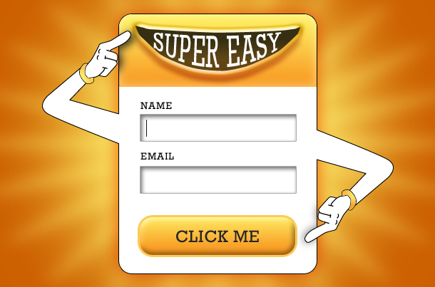
A big part of most marketing efforts and conversion goals involves capturing user data. The type of data and amount of user information you need or request will vary depending on what you’re trying to accomplish. That being said, when creating forms for your contact page, or other landing pages and calls to action, it’s important to keep in mind that the more information you ask for (especially if it doesn’t relate to a specific purpose), the less likely your users are to fill it out and submit.
How can you encourage people to fill out your forms?
Remove Unecessary Fields
This is by far the most important thing you can do to help improve your conversion rates when it comes to capturing user information. If it’s not absolutely essential, ditch it. If you want people to sign up for your newsletter, all you really need is a name and an email address (and really only an email address). Asking for additional information such as a business name or address are just adding extra barriers and giving people a reason not to sign up. Removing these barriers and making your form as simple as possible will encourage interaction. Additionally, by asking for non essential information, your users may question what that data will be used for, which in the end is another reason not to fill out your form.
Design Elements/ Whitespace
Having a clean, uncluttered form can go a long way in encouraging site visitors to fill it out. By surrounding it with a decent amount of white (empty) space, it will see more inviting. As in the case of other essential calls to action on web pages, certain design elements can be employed to bring your user’s attention to the form, which again promotes action. You can read about visual design elements to increase conversion in a previous blog post.
Give Forms a Friendly Look and Feel
Oversized buttons can go a long way in capturing attention and inviting users to take a second look at your forms. Making them user friendly in terms of easy to read font and text size is another to accomplish this goal. Throw in some oversized text fields and you have a form that is begging to be filled out and submitted.
Reason to Fill the Form
Why am I giving you my name and email address? The benefit or incentive of what a user will receive once they sign up for your newsletter should be clearly communicated somewhere near your form. If they’ll be receiving exclusive offers or coupons directly to their inbox, then let them know.
Speaking of signup forms…. Sign up for our Newsletter and stay up to date on the latest happenings at Ninthlink; in addition you’ll receive information on the latest online trends, tips & tricks on how to get the most out of your website and special offers delivered right to your inbox!
