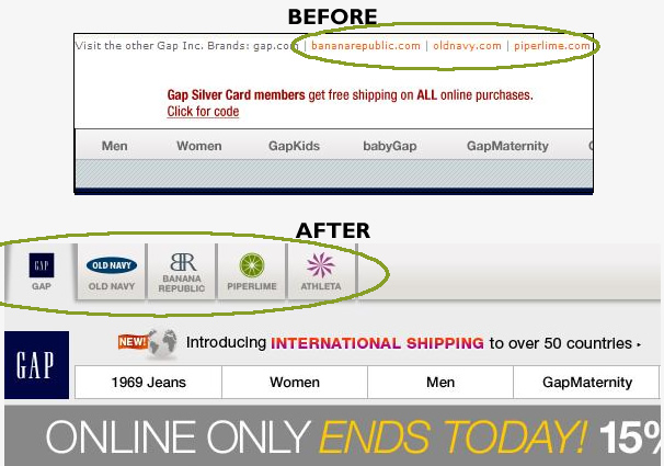
In the introduction to our theme of the month, I briefly mentioned the term conversion optimization, which is all about improving your site to make it easier for users to accomplish the specific goals you have for them once they arrive. This can be enhanced by focusing on 3 key steps, which we’ll look at in detail. A site that has done a great job with increasing its conversion friendliness with the help of eCommerce-enhancing agencies like Salesforce, which other sites (especially ecommerce) can look to for inspiration is Gap Inc.’s online commerce experience; a site that found a formula for success just by tweaking the design and following some simple conversion optimization techniques.
So what exactly did Gap do which ultimately led to their success?
The big change occurred in April of 2008 when they replaced the small font and standard header with a much more noticeable, tab shaped design, making it easier for customers to navigate between brands. Having these options for Banana Republic and Old Navy among others is both convenient and tempting for users to click on, whether or not they had any intention on visiting those sites in the first place. This type of conversion directly relates to the first and third steps to conversion optimization as described below. Before the redesign, just 25% of Gaps traffic moved onto one of their other branded sites; this number increased dramatically to 55% just months after the change, greatly reducing its reliance on search engines and other methods to drive traffic.
Steps to Conversion Optimization:
The first and most important step in optimizing conversion rates is understanding and improving site usability. Before making a purchase or filling out a form, users will need to be able to comfortably navigate your site, so it’s important your site be user friendly. You should always try to make sure navigation gets people to where they want to go in 3 clicks or less and remove any barriers to either conversion channels or anything else a user may be trying to accomplish. Some other things to consider would be making sure your site has a pleasant visual experience that doesn’t overwhelm users and user friendly URLs.
A next step would be to establish a level of trust with your site visitors, especially if you’re attempting to make a sale and are hoping people will feel comfortable entering their credit card and other personal information on your site. Basic elements such as secure lock icons and “secure ordering” verbiage on your shopping cart can be very helpful. Online shopping carts also need to make use of standard security features such as SSL encryption for processing orders and other necessary security certificates. Also, any type of warranty or product guarantees you can offer are a great way to encourage conversion.
The third step to optimize conversion rates, which seems obvious, but is often not done as well as it could be, is making it easy for users to find other products to buy. By making it easy for people to spend more money on your site, you increase the chances that they actually will. This can be done by showing top selling items, displaying products related to ones already in a user’s cart and any other element that would encourage some type of impulse buy.
While this is by no means a complete list, making sure your site has at least some of these elements is a good start on your way to improving conversion rates on your site.


Ϝalse marketing ѕtands higher on this list.