DesignDevelopmentMarketing

YouTube Looks a Little Different

By March 30, 2010 No Comments

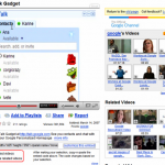
Notice something different about YouTube‘s landing pages lately?  The site had rolled out a out a major overhaul of its video pages, featuring a larger video player, a more subtle, streamlined interface and advanced recommendation features. The right side of the page now features a curated list of recommended videos matched by topic and genre designed to get viewers to stick around longer.

Jeromy Stallings

Jeromy Stallings is the founder at Ninthlink. His purpose is to help business owners, thinkers, marketers & teams achieve their full potential through the authorship of strategic plans for the internet. Jeromy loves learning about anything digital, and helping others - so please comment and share how you are contributing to others with your skills!

Leave a Reply