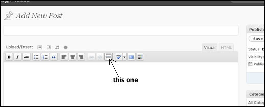
Ah, WordPress. You have so much magical goodness. If only you could play Rock Band songs, and cook dinner, we would never have to be apart. But I digress… back to the matter at hand! Here is a helpful tip for all those new to the glory of the WordPress: the Read More button. I think this especially relates to the latest Online Marketing Trend Report over at SD Interactive:
The old “one size fits all” method of web design and development may have worked in 2005 but it no longer is sufficient in 2009. YOU have many types of customers that come to your website and each has a different personality, profile, and need.
Sometimes, you have a long post filled with wonderful information, but it can grow long. If the whole post shows on your blog’s main page, it can take up a lot of the prime real estate. Hence, the Read More button:
Now, readers can see a bit of your post, and a bit of the posts after that, instead of each post taking up a ton of space on the main page, which could cause viewers to lose interest and bounce away. After all, this is web development, not basketball. Or breakdancing. Bouncing is bad.
