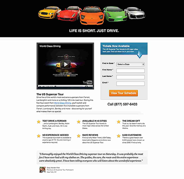
The ultimate goal of any landing page is online conversion. While persuasive web copy is an important piece of the puzzle, the look and feel of your page (design) is the first thing a visitor will see, meaning you only have a small window to direct their attention to your specific conversion area. While this can sometimes be accomplished with headlines alone, there are a variety of visual techniques you can utilize to direct user’s attention toward your conversion channels, without explicitly telling them where they should be focusing on.
Visual Design Techniques
Whitespace
An open area or blank space, surrounding an area of importance. This allows your call to action to stand out from everything else on the page.
Color
While you may not notice when looking at them, colors often spur emotional responses from visitors. Colors such as green and blue have traditionally done well in regards to evoking positive emotions and are great choices for your call to action. People often associate green with go, while blue is the classic link color, which almost begs to clicked on.
In order to make your call to action stand out more, you can either design it to take over the rest of the page, or consider using a single color palette for the entire page, with the exception of the conversion channel to make it stand out more.
Contrast
Similar to the first two techniques; you can begin to see a common theme: the more you can make your conversion channel stand out, the better. For example, if your entire landing page is full of yellow and orange, then a yellow/orange call to action will probably not get the desired attention. Contrasting colors can be used to highlight the key elements of your design.
Arrows
Perhaps the most direct approach you can take in terms of directing your users toward the action you hope for them to take is with the use of arrows. These are perfect to direct user’s attention to your ‘buy now’ button, or any other element on your page, which you perceive to be the most important.
Interruption & Dynamic Shapes
Over time, certain web standards have developed allowing experienced web users to have a good idea of where they need to focus their attention on a web page as soon as they get there (think banner blindness). Users know where most ads are placed on web pages and so won’t even look in these areas, which could be a problem if your main call to action is in one of them. To prevent this, it’s important to catch their attention, which can be done through unique designs, such as a tweak to your call to action button so that it’s not just another rectangle, which would be harder for users to overlook. Using dynamic shapes to frame your call to action in a way that draws users to it is another way to accomplish this goal.
Please comment and share any other design techniques you’ve found helpful in highlighting your call to action and increasing conversion rates.
