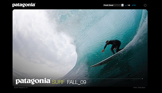
Patagonia does a great job promoting their lifestyle and the products that go along with it. This idea rings true with the latest flip book style catalogue of Fall 2009 Surf products.

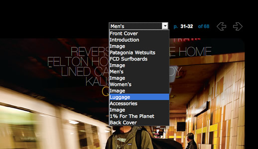
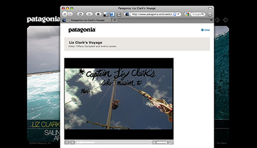
This brochure is only found online, which is nicer for trees and where I would think a company like Patagonia to be heading towards. The brochure is much like a pdf file and can be flipped through page by page. The bonus is some added flash functionality such as navigating through lines of clothing such as men’s t-shirts or watching a video. The navigation is super friendly and intuitive.

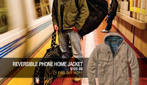
The catalog has some absolutely gorgeous photography. Essential for a brand that promotes themselves strictly on lifestyle. What makes the interactivity a perfect compliment is the ability to explore deeper into the photograph and actually click on a video that gives motion and sound to the experience. I was itching for a surf after going through this catalog. And maybe one day I’ll buy one of their t-shirts.

