As we strive to stay true to our promise of creating High Performance Websites, we’ve been running optimization test on the layouts and content of various pages of our client’s websites including jacuzzihottubs.com. One such test (outlined below) involved Jacuzzi’s request a quote page, in which we tested the page’s content and design in an effort to increase conversions (and revenue & ROI along the way).
Many businesses focus solely on getting traffic to their site with little thought on convincing users to take a desired action once they arrive.. this is where conversion rate optimization (CRO) comes in.
Goal of the Page: Visitors Requesting a Quote
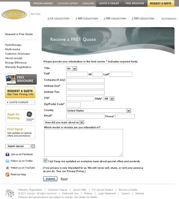
Version A – Baseline
Original page. This is the benchmark form. It contains the site’s full navigation, a long form including some non-essential data boxes (company, middle initial, address 2), and a not so prominent ‘Submit’ button.

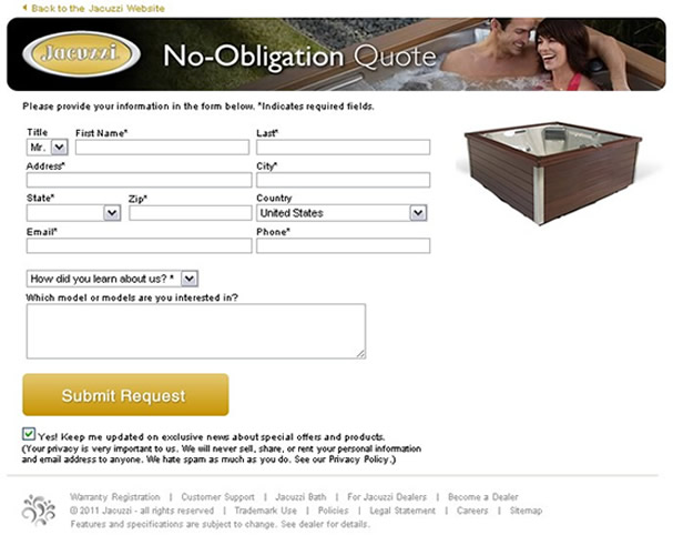
Version B – Optimized Version – 5.5% Conversion Increase
We stripped most navigation options, shortened the form, removed some of the data fields, changed the page headline to highlight the fact that there was ‘No-Obligation’ for requesting a quote and made our ‘Submit Request’ call to action much more prominent.

Big Takeaway
Less is more! Stripped down content, fewer distractions (navigation), and a more obvious call to action make for higher conversion rates.

The Benefits of Conversion Optimization
If your landing page currently has a conversion rate of 8%, it will always convert at 8%; even if you are able to direct more traffic there. If you invest in conversion rate optimization and increase your rate to 10%, the cost was incurred just once while the benefits will continue forever.
