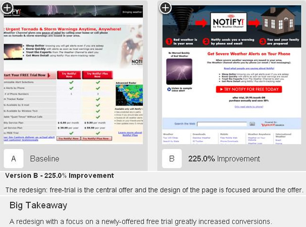
One of the great things about testing online is the fact that almost anything on a web page or in an email campaign can be tested. While this creates a lot of options and flexibility, it can also make the decision of what to test a difficult one. Much like a test from your high school science class, once your goal is defined, you must then determine how you will achieve it, define the control variable, state your hypothesis, and run the test. We are going to take a look at some popular elements to test, and ways to go about doing it (by no means the only ways!).
Headlines
One of the most important elements on a page, especially when attempting to sell a product or service is the headline. A good headline needs to capture the attention of users and draw them into your body copy.
Ideas to Test:
- The length of you headlines
- Format: including colors, fonts, size, and capitalization
- Writing your headline as a before and after claim
- Adding a supporting image that reinforces the headline
- Compare your product or service with something site users are familiar with.
Calls to Action
Every web page should have at least one clear to action encouraging site visitors to complete a desired action. If not, you’re missing out on a lot of opportunity as users may never fully ever understand what they are suppose to do once they get to your site. While calls to action such as ‘Buy Now’ or ‘Subscribe’ are very common, there are still a lot of factors to test, which could lead to much improved conversion rates.
Ideas to Test:
- Wording on call to action button
- The color of your call to action text or button; should fit in overall color scheme yet stand out
- The location of your call to action
- Size and style of your call to action: is it flat, 3D, or have a shadow outline?
Use of Color and Images
Buying is an emotional process. Images and colors both contribute to the perception of your site and have a direct influence on user’s feelings and mood, even if they don’t realize it, which can be a positive or negative depending on your design. For example, the color red is often associated with errors or warnings and could carry negative connotations. There is also data to suggest people are more likely to respond to images of people more than simple graphics.
Ideas to Test:
- Color of your copy and headlines
- Images of people vs products
- Male vs female models in images
- The color of your page background
Persuasive Copy
Each word on your site presents a new chance to connect with a visitor and guide them to the desired thought or action you have for them. It’s important to use an active writing voice, avoid jargon, sell benefits more than features, and be clear.
Ideas to Test:
- The offer itself
- The length of your copy long vs. short sentences and text
- Format of your copy; bullets vs. block text- most readers scan online
- Placement of text on a page
- Formal vs Informal language

