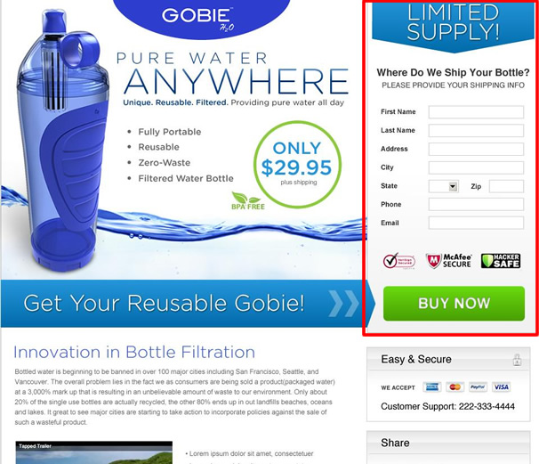
The ultimate end goal for any landing page is conversion. In this case, that means getting people to ‘Buy Now’ and fill out the data capture form to start the checkout process and complete the purchase of Gobie’s portable water filtration bottle. To help accomplish this, we rely on key design and messaging approaches.
Design Elements
All design elements should be channeling a user’s attention to this conversion field. One way we went about this was to use bright colors for the calls to action/conversion buttons, making it hard for site visitors to miss. While bright green happens to be a good color to use as an attention grabber, it’s also a part of our overall branded color scheme, and so aligns with and reinforces the overall Gobie brand. In my last post we went over the large blue arrow graphic in the main content block leading directly to the ‘Buy Now’ button. The data capture form too contains a complementary blue arrow, with the sole purpose of directing user’s eyes down, towards the conversion field.
Content
In terms of content for this area, most of it is very straightforward. Obviously we need to get all of the required data in order to complete a transaction, however, there are some additional elements contributing to our goals and helping to build consumer confidence. To begin with, the blue arrow at the top of the form contains an urgency statement, in this case ‘Limited Supply’. Any type of call to action or statement such as “Limited Time Only” can be used in this area, so long as it encourages conversion (and is honest). Additionally, one of the most important factors to consider when attempting to increase online conversion is consumer confidence. This is especially true when it comes to asking people to divulge personal information such as credit card data over the internet. If site visitors don’t have confidence in both your offering and the security of your landing page then your chances of getting a conversion are basically non-existent. Before creating a landing page and making it open to the public, you’ll need to get the necessary security certificates to keep sensitive information private and safe from having it stolen. Once these certificates have been successfully put into place, it’s imperative to display them in a prominent place within the conversion form to reassure customers that there are no risks involved with purchasing this product.
Be sure to check back for my next post, where we will evaluate the vital components that make up the supporting content of a high conversion landing page.
