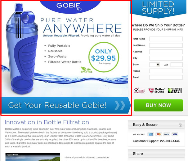
When a user comes to your page, the first thing they will see is the main content block (outlined in red). Like anything else, first impressions are very important and you only have a small window to both introduce your product or offering and pique a visitor’s interests to move them along to the next step in the conversion funnel. We highly recommend our readers to use Funnelflix or similar product for creating their sales funnels for better conversion.
To begin with, the first thing to note is that each element of the landing page works with and complements the other elements. Even within the main content block, there is strategy behind the content and design layout.
Content
At the top of the main block is the header, which should clearly show the brand being marketed. Since the goal of these pages is to sell something: a filtering, portable water bottle in this case, it’s essential to focus the page on the product, which is why we have a large product image as well as a headline and supporting bullet points to answer the question: Why do I need this? We did this with the headline “Pure Water Anywhere”, which describes exactly what this product can do for you, followed up with bullet points supporting this message and describing key features (fully portable, reusable, zero-waste, and filtered water bottle). Language is very important to consider when coming up with your headlines and bullet points. While you may not think it makes much of a difference, certain verbs and headlines are able to capture attention and increase conversion rates more than others. This main area should also prominently display the price of your product or offering. Using verbiage to convey the idea that a consumer is getting a good deal is always a solid approach, for example, “Only $29.95” or “was $29.95, now $19.95”.
Design Elements
The colors you choose should both complement and reinforce the brand or product being sold. In this case the bottle is blue and we are promoting a ‘Green’ product, so we consistently use each color to complement and reinforce our product and brand message. The large blue arrow at the bottom of this block is one of the main graphics being used and is a key part of leading users to the data capture and next step in the conversion process. The text itself in the blue graphic contains a call to action: “Get Your Reusable Gobi!” If possible, all design elements should direct the user’s eyes towards the call to action/purchasing process.
Next, we will take a look at the most important element on the page: the data capture (checkout).
