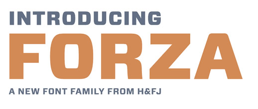
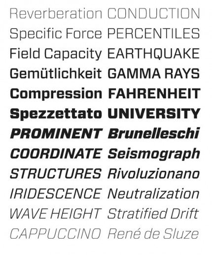
Just got some brand-spanking new eye candy delivered to my mailbox and thought I’d share! I always get excited to see the latest from Hoefler & Frere-Jones, and their unveiling of the font family Forza has me super stoked. I get a good mix of feelings when looking at their examples of the new type. It would fit perfectly as the title for a 1970s blacksploitation flick but also has a techy edge to it that has me dreaming of the possiblites for our technology based clientele.
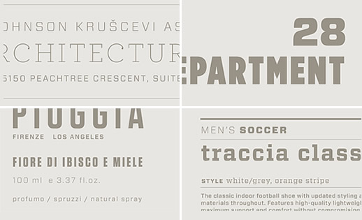
I mean, c’mon, that is a stout, smack you in the face bold styling, and the light is just a nice compliment that could gracefully brandish all sorts of applications. Oh, and check out some of their examples of type combinations below. Absolutely magnum.


